Corpotate Wordmark
The balanced arrangement of five alphabetical letters of POSCO, with 'S' in the center, symbolically represents the corporate philosophy that aims for the balance of inside and outside, together with harmony. The concentric letters reflect the future image of POSCO that actively handles the external environment and sustains permanent development through constant innovation. The color blue represents innovation and sustainability in POSCO as a global brand.

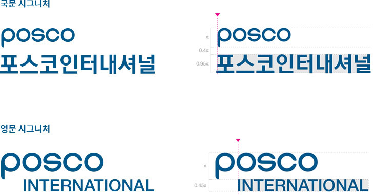
Logo Types in Korean and English
The logo types in English and Korean are designed in consideration of its harmony with the POSCO corporate wordmark. In order to ensure coherence of the visual identity, it cannot be used in modified forms.

Signature
POSCO INTERNATIONAL’s signature, developed with a uniform visual image in mind, was created to foster a unified corporate identity for its organization members and to convey a consistent corporate image outside of the company. As a rule, the data in a storage medium must be scaled in direct proportion. The Korean and English signature must be placed in the lower-right corner of the word mark.
Designated Color
The designated color not only represents the unique image of POSCO INTERNATIONAL’s corporate brand, but also plays a significant role in the formation of the company’s visual identity by being used in the signature and other elements. It requires careful attention as different displays used to present the color would have different settings regarding brightness, saturation, and so on.
POSCO
BLUE
BLUE
PANTONE
302C
302C
C 100 M 35 Y 0 K 40
R 5 G 80 B 125
R 5 G 80 B 125
POSCO
LIGHT BLUE
LIGHT BLUE
PANTONE
299C
299C
C 85 M 10 Y 0 K 0
R 0 G 165 B 229
R 0 G 165 B 229
POSCO
DARK GRAY
DARK GRAY
PANTONE
Cool Gray 11C
Cool Gray 11C
C 85 M 10 Y 0 K 0
R 0 G 165 B 229
R 0 G 165 B 229
POSCO
LIGHT GRAY
LIGHT GRAY
PANTONE
Cool Gray 4C
Cool Gray 4C
C 0 M 0 Y 3 K 30
R 189 G 189 B 186
R 189 G 189 B 186
POSCO
GOLD
GOLD
PANTONE
871C
871C
POSCO
SILVER
SILVER
PANTONE
877C
877C